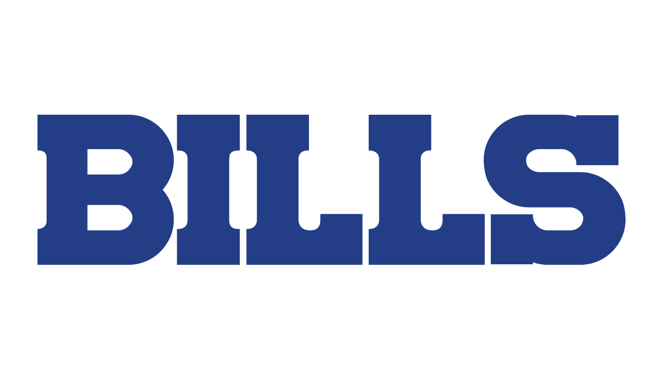
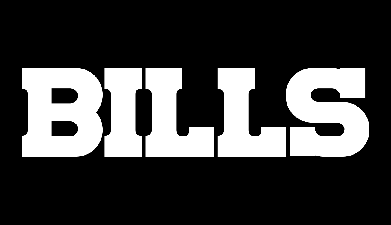
BUFFALO BILLS
In 2011, While Employed at the NFL, I was tasked with updating the wordmark of the Buffalo Bills to something that felt strong and tough yet approachable, without straying too far from the previous, existing design. I decided on a heavy monoweight type with chunky slab serifs that spoke to the dedicated working-class folks that attend the games and make up the majority of the Bills fanbase. The lifeblood of the city.


